
Introduction
So today we are going to go through the example of visualizing geospatial data in a form of heatmap, straight from csv file. Our main goal is to discover the purpose of tools used in this simple, but very valuable use case.
Our data
The data used in this tutorial is taken from Cary town OpenData portal. We are going to take a closer look on crime mapping dataset.
Why would we want that particular dataset? In example: if you would consider buying a house in that area, it would be great to be aware which parts of the city are the safest for you children! 🙂
Tools used
Azure Notebooks
First tool we are going to use is Azure Notebooks. It is Azure-powered, Software as a Service version of Jupyter Notebook. To put it`s purpose in simple words - it allows you to easily write, run (in the cloud) and share your python code directly in the browser!
Python
Not much to explain here, but it is worth mentioning that in this article we are going to use Python 3.6.
Pandas
Pandas is something I have known about for a while, but recently I had a chance to put it into work for our client at HugeServices and I have to admit, this is my discovery of the year. If it comes to data science, I have used in example numpy, but pandas in on another level.
What does it exatly help us with? According to the official page: "pandas is an open source, BSD-licensed library providing high-performance, easy-to-use data structures and data analysis tools for the Python programming language".
The most basic thinking to know about pandas is what are Series and DataFrames - I strongly recommend you to learn that. In example here.
Folium
Folium is a visualization library for python based on leaflet.js maps.
Tutorial
Azure Notebooks configuration
- Go to Azure Notebooks Portal

- Login with your Microsoft Account
- Open
My Projectstab

- Click on
New Projectbutton

- Fill-up the creation dialog and hit
Create

- Click on
Newbutton and selectNotebookfrom the dropdown list

- Fill-up
Notebook Name, selectPython 3.6and hitNew

- Open a newly created notebook

- A view like below should appear

- Fill-up first cell with the code below
import numpy as np
import pandas as pd
import folium
from folium.plugins import HeatMap

# Read the data from the remote resource as DataFrame
df = pd.read_csv('https://data.townofcary.org/api/v2/catalog/datasets/crime-mapping/exports/csv',
                 sep=';',
                 usecols=['lat', 'lon'])
# Remove all rows with missing values
df = df.dropna(axis = 0, how ='any')
# Display first 5 rows of the DataFrame
df.head()
- Hit
runand you should be able to see the top 5 rows of the DataFrame

- Fill up the newly created cell (visible under the first cell, after invoking the run action) with the following code and hit
runagain
# Calculate approximated center point for our map view
center = [np.mean(df.lat.values), np.mean(df.lon.values)]
# Setup our map
map = folium.Map(location=center, zoom_start=12)
# Setup our heatmap layer
heatMap = HeatMap(zip(df.lat.values, df.lon.values),
                   min_opacity=0.1,
                   max_val=5,
                   radius=5, blur=15,
                   max_zoom=1)
# Adds the headmap to the map and returns the map itself so this will be displayed as a result
map.add_child(heatMap)
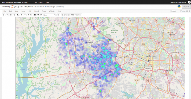
- After this step a map view should appear
Results
If everything went ok, you should be able to see an interactive map with a heatmap on top of it.

Summary
There is a lot of geospatial data to be visualized out there. I hope this way of doing it will appear useful for you. I highly encourage you to share your story in the comments section on what kind of data you have visualized and what did you conclude from it.
P.S. this tutorial can be realized using just Jupyter Notebook instead of Azure Notebooks as well. To setup the environment on your own machine, I highly recommend Anaconda. Anyway, our choice here is Azure Notebooks, since it is easier/faster to start with (i.e. pandas and folium dependencies are already preinstalled for us).
Stachu
This is awesome! Thank you